Go Plans
Repositioning
About Go Plans
Go Plans had already launched, but it was not yet a strong commercial brand. Revenue was inconsistent, enquiries skewed heavily towards price, and the business needed a clearer position in the residential architecture market.
I was brought in as an external partner to lead the repositioning — brand strategy, identity, website and the customer journey behind it — with one commercial goal: attract better-quality leads, convert more of them, and build a pipeline the business could grow.
Challenge
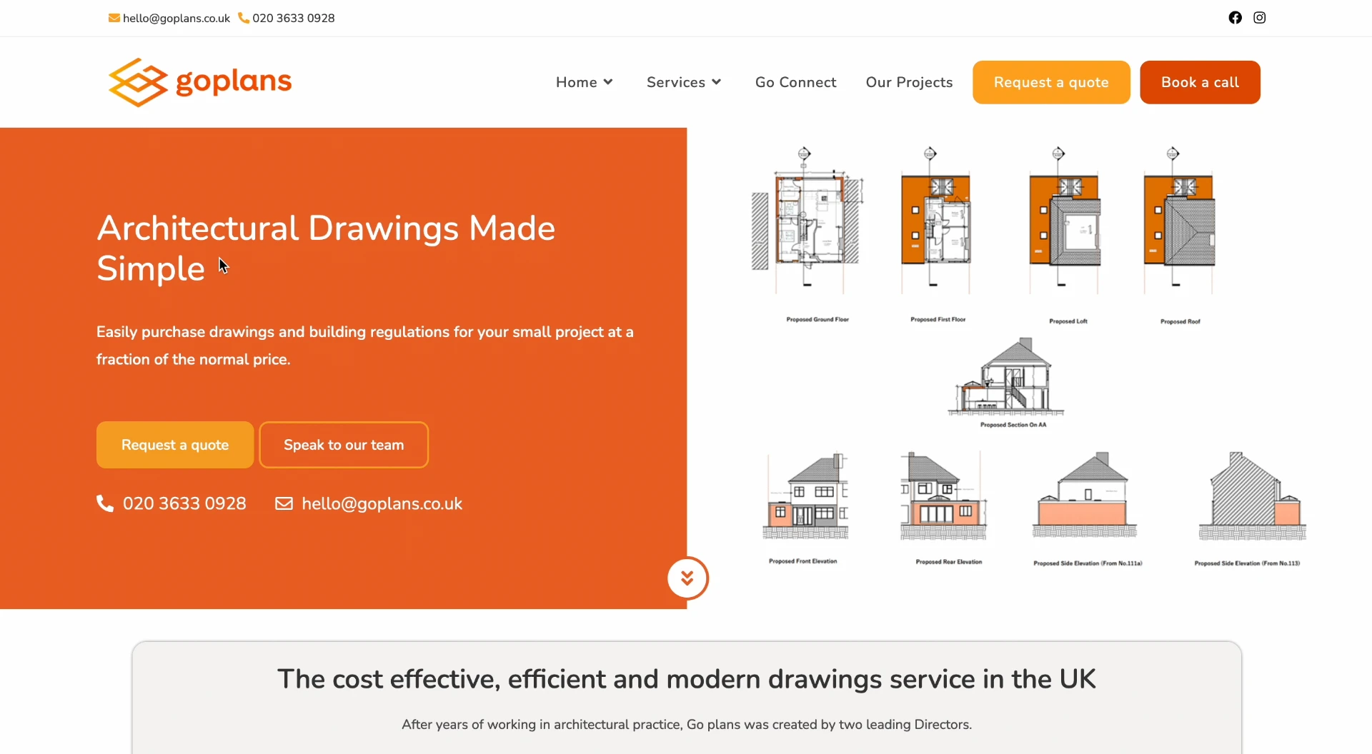
Go Plans had launched as a fast, low-cost online service, and its original brand said exactly that: a price-led website, a bold orange identity, and an offer built around speed and saving money.
By the time I was brought in, the business had moved on. It offered far more support and far greater design input than its brand suggested, but it still looked and felt like a budget service.
That had a direct commercial cost. The website kept attracting heavily price-driven enquiries, revenue was inconsistent, and the higher-value projects Go Plans was now equipped to deliver weren't coming through the door.
Solution
The fix was a deliberate repositioning, not a visual refresh: move Go Plans into the space the market wasn't serving — more personal and design-focused than a low-cost online service, but more accessible, faster and better priced than a traditional architecture practice.
The aim was to compete on value rather than price, so the business could win better projects without discounting to close them. Every part of the new brand and website pointed at the same outcome: help the right people understand what Go Plans does, trust it quickly, and enquire.
Before
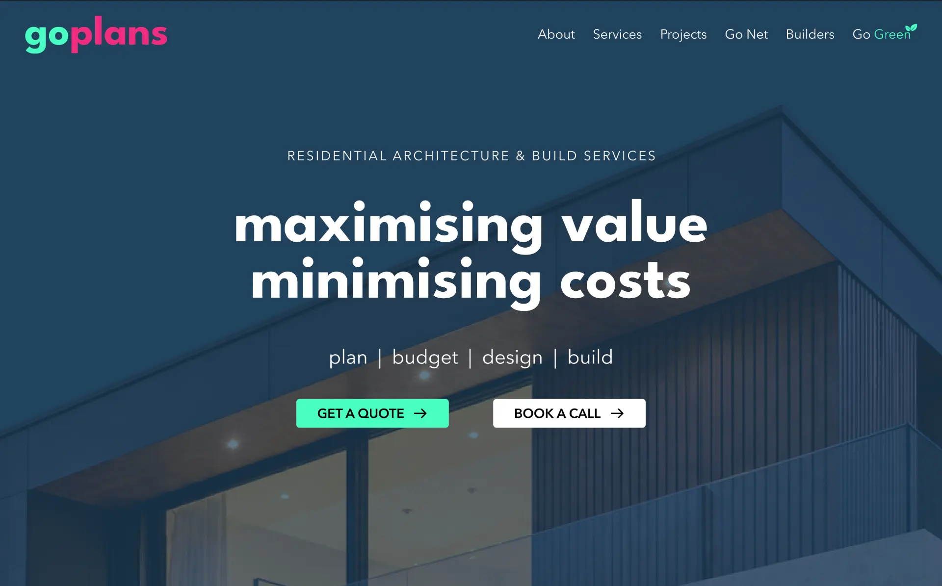
After
Brand Identity & Positioning
Move the focus away from price alone and towards value, expertise, speed and customer support — and make that shift obvious in the first few seconds.
The positioning sat deliberately between low-cost online architecture services and traditional, higher-priced practices: professional and design-focused, but still approachable, efficient and competitively priced.
I created a completely new visual direction in navy, bright mint and pink to break the generic, price-led look and give Go Plans a personality people remember. Navy brought credibility and structure; mint and pink added energy and a slightly playful edge.
A distinctive brand is a commercial asset. It makes a business easier to choose, easier to recommend and easier to pay a fair price for, while still carrying the trust an architecture client expects.
Typography
Headings
League Spartan
AaBbCc123
Paragraphs
Avenir Next
AaBbCc123
Colours
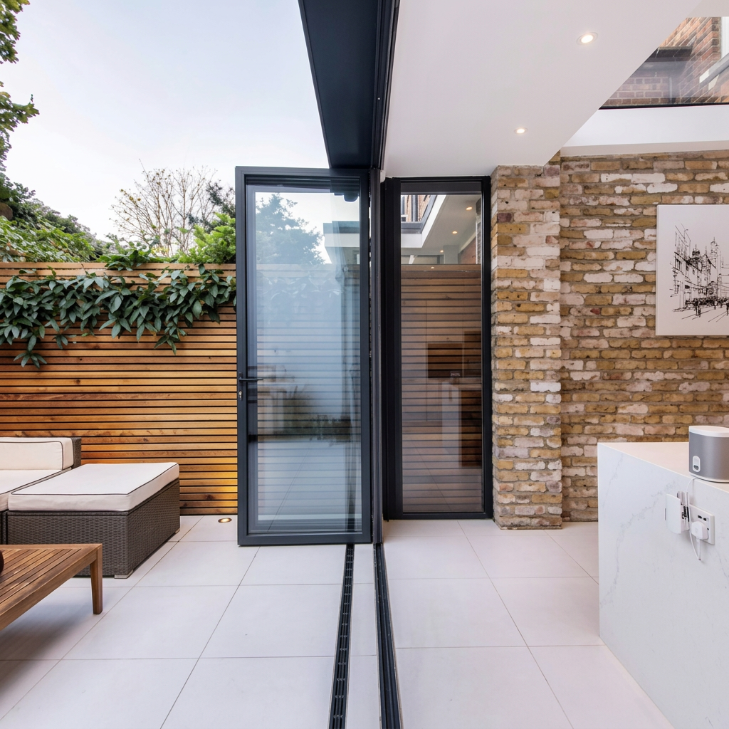
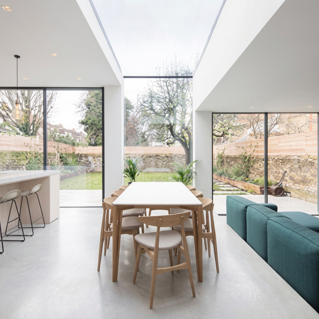
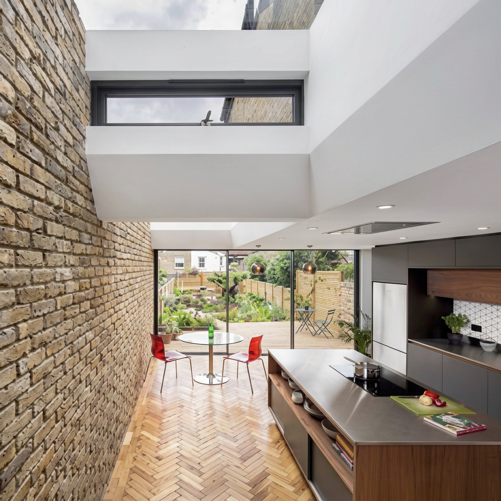
Mood board
UX, Customer Journey & Content
As Go Plans expanded its services, the website had to make a more complex offer feel simple — and turn that clarity into enquiries.
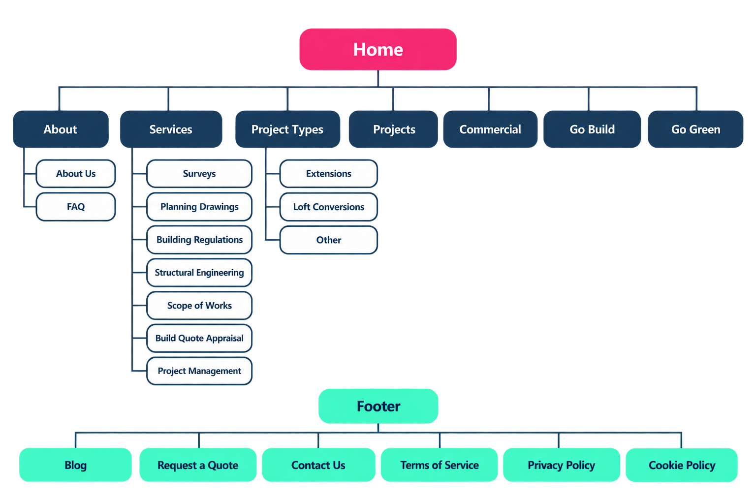
I rebuilt the structure around the customer journey: clearer service pathways, fewer dead ends, and a strong route to enquire from every page. The commercial centrepiece was the instant online quote tool I introduced and designed — visitors get an immediate price indication, Go Plans gets a captured lead with full project details. It became one of the strongest conversion routes on the site, with the majority of submitted quotes progressing into clients.
I designed the site structure and page layouts in Figma, wrote the initial copy and worked with a copywriter to refine messaging and tone, then briefed and worked directly with the external digital agency through development so the final build stayed true to the design, the content and the commercial objective.
Sitemap
Customer journey overview
Online quote
Results
The rebrand, the new website and the instant quote tool changed the shape of the pipeline: more visitors, more enquiries, and a higher share of them turning into work.
Website traffic
+0%
Lead conversion through the online quote form
Strong
Website enquiries
+0%
Digital Marketing
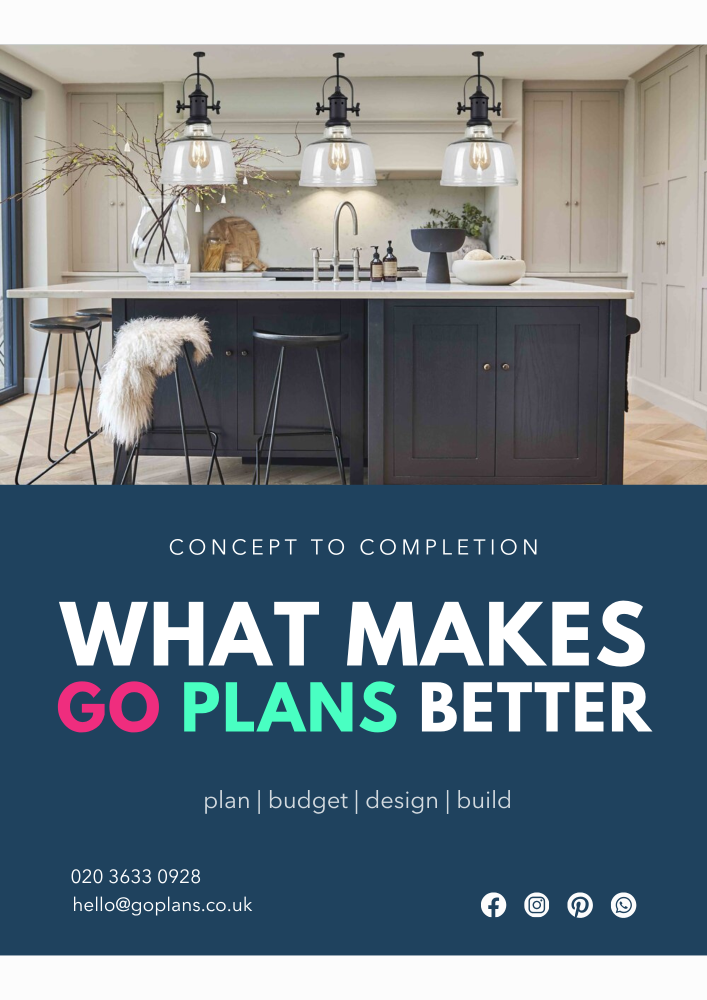
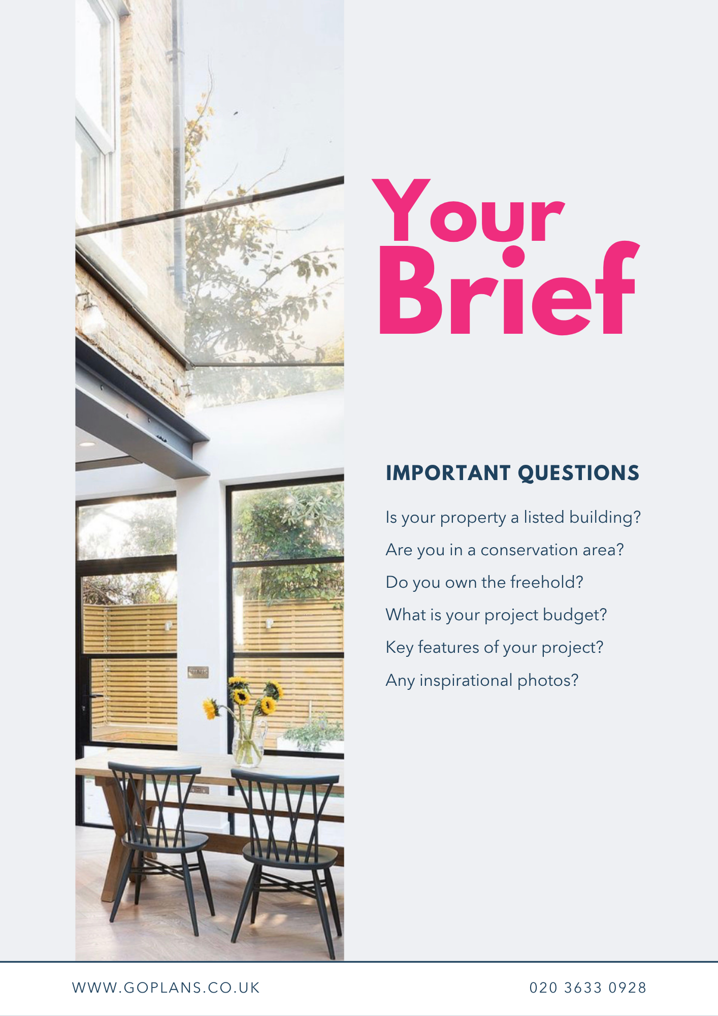
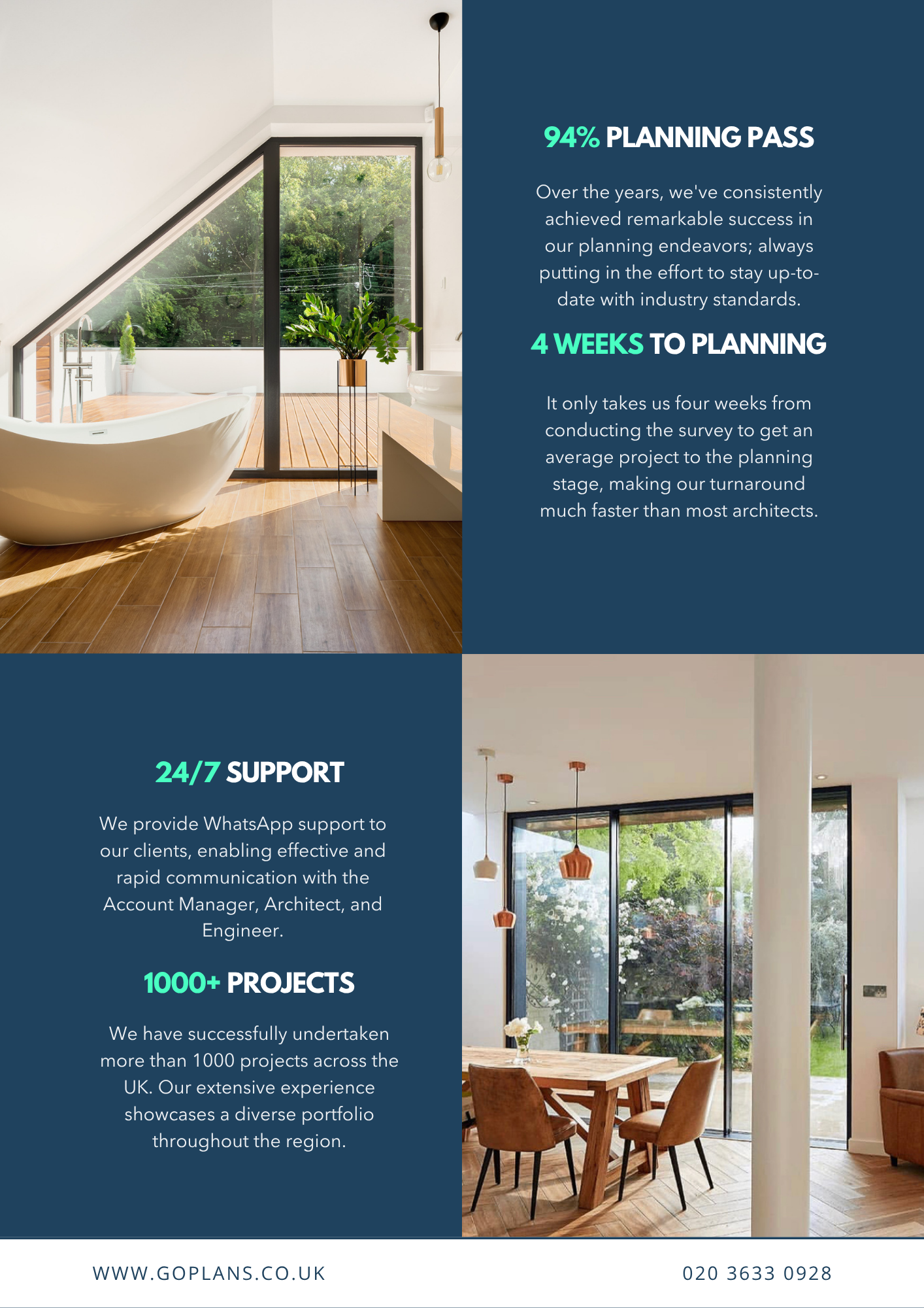
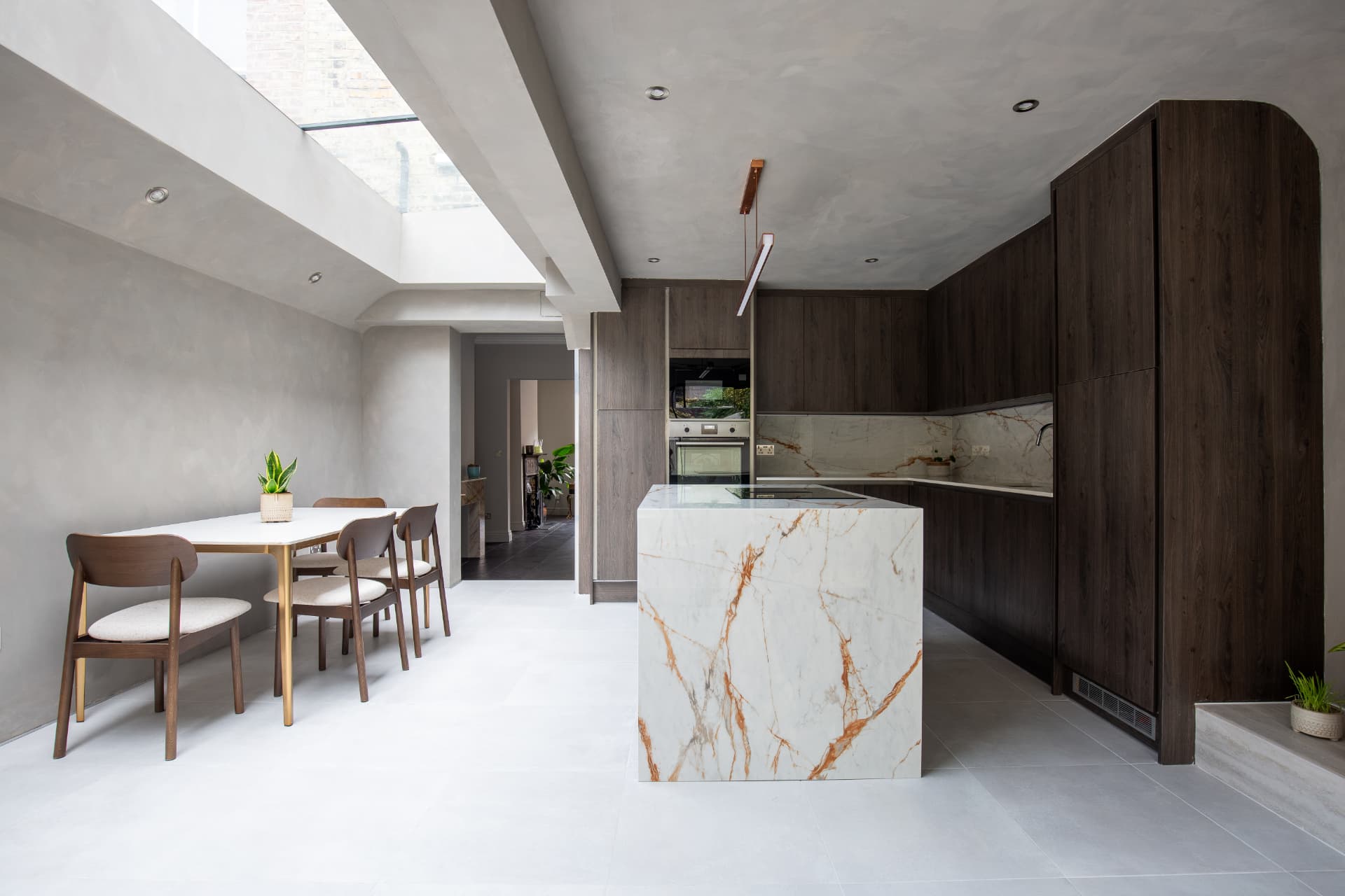
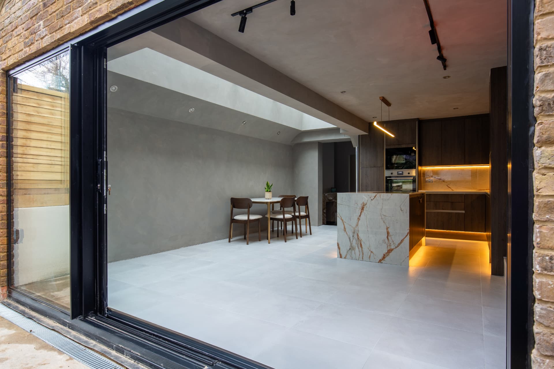
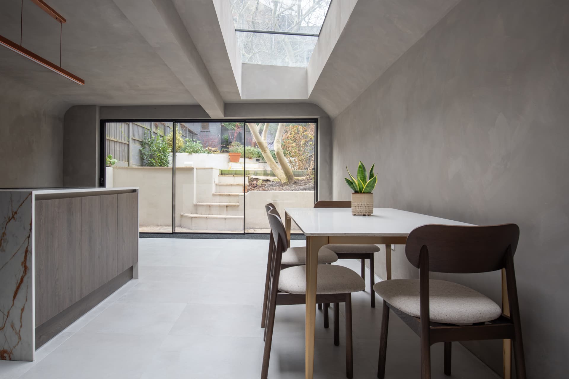
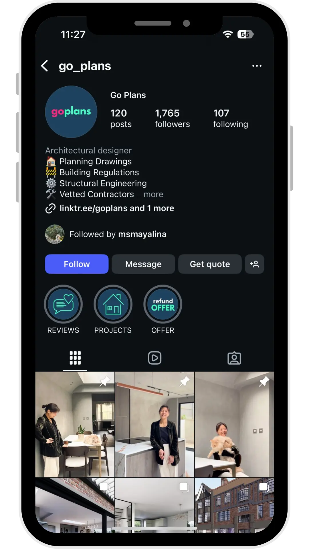
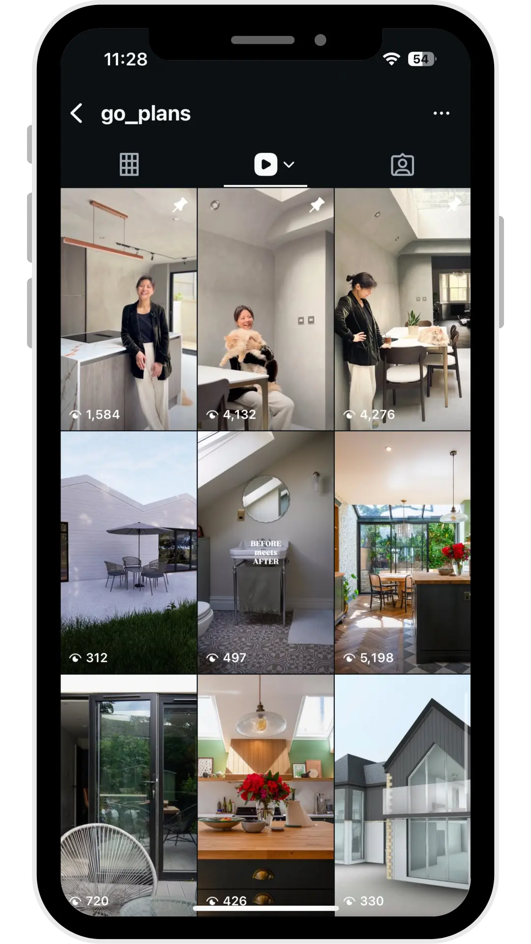
After launch, I built Go Plans' digital marketing out around the new identity — social media content, email campaigns, photography, video and sales brochures — so the brand stayed consistent, recognisable and active across every customer touchpoint, and every asset pulled in the same commercial direction.
Sales and service brochure
Project photography
Social media
The Outcome
The rebrand elevated the business. Go Plans was no longer the cheap online option — it was the personal, design-led alternative to both low-cost services and traditional practices.
After launch, the website brought more traffic, more enquiries and longer time on site, while the online quote journey became one of its most reliable sources of converted leads.
From mid-2023 the business grew rapidly: project demand rose, and additional staff were brought in to keep up with the workload.
What the engagement delivered was the outcome it was designed for — a clearer market position, a measurable lift in enquiries, and a customer journey that turned interest into signed work.
Go Plans ceased trading at the beginning of 2026, so the website and social channels are no longer live.
More
work
Wildstahl
Website & Brochure
Spaces & Interiors
Photography
 Coming soon
LMB Group
Photography, Brochure & Social Content